

The application of color for SL must be sensitively revised for each media (print, multimedia, various structures, or tridimensional structures). In particular, printing method, ink concentration, paper texture and others must be revised to follow the standard color set by the manual. The visual equivalence must be carefully revised and observed based on the standard color.
PANTONE® 281 C Location : 75%
SL’s auxiliary colors are the colors that represent SL with the standard color. These are SL Red, SL Orange, SL Yellow, SL Green, SL Purple, SL Violet, SL Turquoise, and monotone SL Gray, SL Gold, and SL Silver. To ensure consistent color execution in various media and channels, the color regulations specified in this section must be observed.
Careful attention is required when the background color is applied to the symbol. The most desirable background usage is when the symbol is executed with its chosen color on a white background, but in cases of non-white backgrounds, the background color standards must be met. Applications on complex backgrounds must be avoided.

Gold & Silver

Emboss effect


Emboss effect

Emboss effect


Emboss effect

These are examples of misuse, such as distorting the shape of symbols or signatures or changing colors. Use the examples to prevent making any type of changes similar to those stated below.
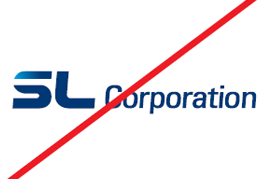
Do not arbitrarily change the form of symbol or logo type.
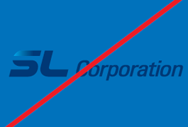
Do not damage visual awareness by applying a background color with a similar brightness or saturation to that of the symbol.
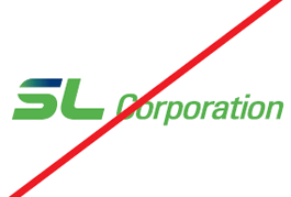
Do not change the color of the symbol or the logotype.
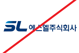
When writing Korean signatures, symbols and corporate name logotypes should not be combined.
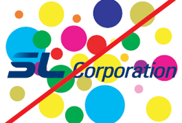
Do not damage visual awareness by applying a signature on top of a complex background.
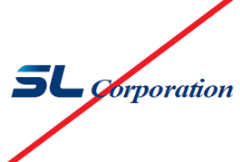
Do not use any designated typeface or other typefaces for the logotype.
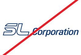
Do not outline the symbol.
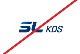
Do not use a combination of KDS or HSL, the joint venture, with the symbol as a signature form.